Case Studies: Designing Logos for Businesses
Firstly what makes a logo remarkable?
A remarkable logo is one that stands out and effectively represents a brand. In this informative blog post, we will thoughtfully share some essential key elements that significantly contribute to a logo's memorability, visual impact, as well as detail some highlights from our past portfolios that effectively demonstrate our commitment to helping our clients achieve success!
1. Simplicity
Clean Design: A simple logo is not only easily recognizable but also remarkably versatile in various applications. It should effectively convey the brand's core message without introducing unnecessary complexity or distraction.
Memorable Shapes: Simple shapes are inherently easier for people to remember, making them more impactful and visually appealing. These shapes can create a lasting impression, helping the brand to stand out in a crowded marketplace.
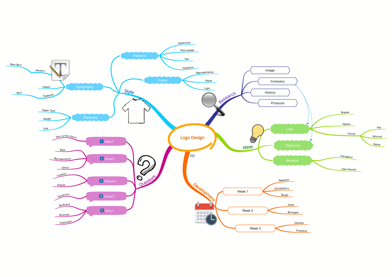
As a dedicated creative brand agency, we carefully respond to a brief provided by our client that outlines their specific goals and expectations for the project. Firstly, we start with mind-mapping after a simple 5 questionnaire is sent to potential clients.
A process that starts with mind-mapping, then moves to mood boards featuring competitor branding, colors, typography, and more.
Unlike with western clients, we have the luxury of time to thoroughly complete our brainstorming sessions, as they tend to value more the process of conceptualization before moving on to execution. Clear communication and mastering each step before progressing is crucial for them.
What are the differences between Asian and Western demands on design?
The demands from each culture are quite different and are significantly affected by various factors, including specific goals, communication styles, budget constraints, deadlines, and other relevant considerations.
Bright Design Studio works as a brand ambassador, connecting Eastern and Western markets. We adapt your designs for Asian markets and vice versa for the USA and Europe.
In the case of most Asian businesses that we have served, the deadlines are often significantly reduced, typically ranging from a few days to about 2 weeks to complete a branding booklet that includes the logo. This creates a different dynamic in our workflow and project management in comparison of Western businesses. Asian clients prioritize graphics and messaging that align with cultural markets. In China, we must design bilingual logos and marketing materials thus flexibility is crucial due to the fast paced competitive market.
Case Study: Kebaobao 可宝宝 Logo
Research for kebab logos that incorporate distinctive typography while drawing inspiration from the characters of Kung Fu Panda, particularly the lovable character Po. Post discussion with our client, they wanted Po to be the main mascot for their business serving Kebabs, Paninis to Sandwiches in Shenzhen, with the use of red, yellow and blue as the main popular colors targeting students to working class market. Majority of such targeted groups in China prefer cuter characters holding the food or products a business is serving.
Looking closely at how Po’s design elements can influence the style and feel of the kebab logo, ensuring it captures the essence of both delicious food and playful creativity. We explored on different perspective and versions of Po such as Po with Chopsticks, Po with a hat, Po doing Kungfu moves only, and etc.
Typography designs inspired by anime, comics, and martial arts films, examining various widths and styles.
2nd stage: Our in depth discussion with clients allowed us to explore different mascots such as a Chef, a Camel to now a Panda. Client’s final selection is a panda as a mascot holding a kebab wrap or skewers.
3rd stage: Character Finalization and Exploration of Typography English and Chinese “可宝宝“
4th stage: Test on fonts and colors
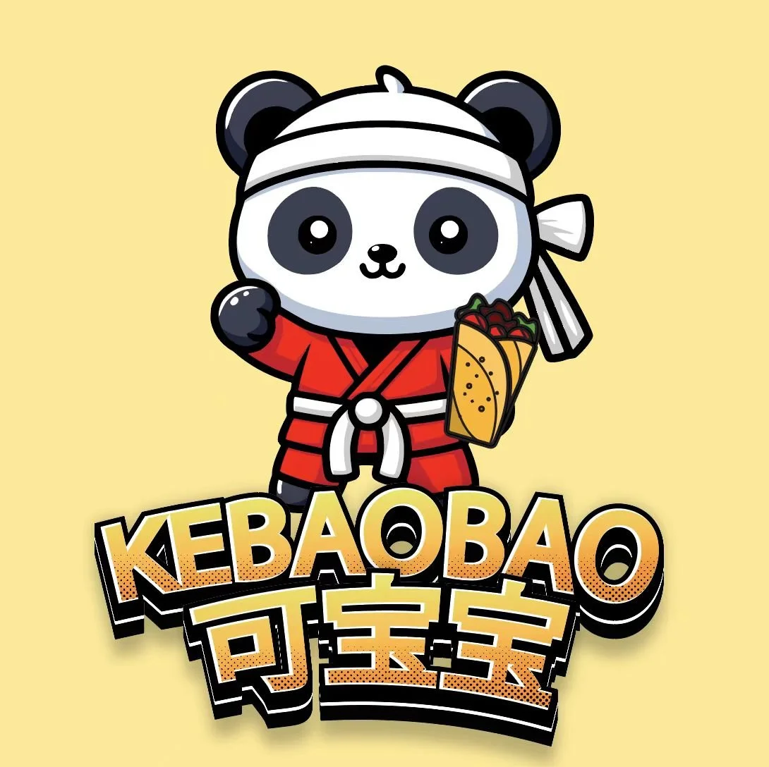
Finalized version for KEBAOBAO! KEBAOBAO logo serving Kebabs, Pizzas and Paninis in Shenzhen, China. Embracing Panda as the National symbol of China, wearing kungfu outfit with a kebab in hand.
2. Relevance
Alignment with Brand Identity: Paul Rand’s wisdom shines through once again, reminding us that a logo is not meant to be a sales pitch but rather a symbol that identifies your brand and positioning. The logo should reflect the brand’s values, mission, and target audience. It should resonate with the market it serves. Use appropriate imagery. Use symbols or elements that relate to the industry or brand purpose, helping consumers instantly connect with the logo.
““A logo doesn’t sell (directly), it identifies.””
Examples of logos and its meanings:
In reference to: https://logos-world.net/alibaba-logo/
Alibaba- It’s versatile, practical, and memorable in its design. The logo effectively showcases a lowercase "a" that uniquely features a human face embedded within, adding a creative and personal touch to the overall appearance.
The corporation's name is integral to its logo, named after Ali Baba from One Thousand and One Nights. Jack Ma conceived this idea in a San Francisco café, appreciating the character's global recognition and the name's simplicity.
LG's design clearly shows the ‘L’ and ‘G’ within a circle. The ‘L’ resembles a nose, while the ‘G’ creates the rest of the face, although not everyone may see this.
In reference: https://www.thebrandingjournal.com/2023/04/logos-hidden-meanings/
Adidas’ logo is one of the most famous and recognizable in the sports world today. But did you know that the three lines situated on top of the words are intentionally designed to represent a mountain? This design choice symbolizes the numerous hardships and obstacles that athletes face throughout their journeys and the perseverance they demonstrate when overcoming these challenges.
In reference: https://www.mi.com/global/about/
Xiaomi- The "MI" in our logo stands for "Mobile Internet." It also means "Mission Impossible," reflecting the challenges Xiaomi overcame in its early days. Xiaomi now is celebrating her 14th years anniversary.
3. Uniqueness
Distinctive Elements: A remarkable logo is essential as it sets the brand apart from its competitors in a crowded marketplace. It should be original, creative, and not easily confused with other logos, ensuring that it stands out in the minds of consumers. By doing so, it contributes significantly to the brand's identity and recognition.
Are symbols effective for logos?
Using symbols in logo design helps communicate your brand's message clearly and quickly to your audience. These symbols can include shapes, colors, icons, and more.
When designing a logo for the first time, list the colors, fonts, and shapes that reflect your brand. Then, narrow it down to what will appeal to your audience and stand out from others. The style you choose can enhance your message. For example, an owl represents intuition and wisdom. A blocky, bright-colored owl suggests a modern or techy feel (like HootSuite or Trip Advisor), while a realistic owl gives a traditional, earthy vibe (as seen in Rice University or Manifest Building). Both styles convey the idea of excellence and insight, but serve different target audiences.
Speaking of colors, what is the psychology behind it?
Color psychology is the idea that specific colors cause physical or emotional responses, influencing how people behave or react to it. It's not just about seeing red and getting angry or seeing blue and feeling calm—but it's similar.Research suggests that the color red correlates to an increase in blood pressure, and the color blue corresponds with a decrease.
Due to this impact on behavior, color can play a big role in creating a mood of a brand experience.
According to Architectural Digest, this makes the process of choosing the right paint colors particularly crucial for effectively setting the overall tone and atmosphere of your home. Warm colors typically energize a space and create a lively ambiance, while cool colors tend to calm the environment and promote relaxation.
Warm Colors
Red: Associated with passion and energy, red stimulates the senses and can raise heart rates. Too much red may cause aggression or anxiety.
Orange: A warm, friendly color that blends red's energy with yellow's cheerfulness, often used to promote conversation in social settings.
Yellow: Represents happiness and optimism, brightening moods and inspiring creativity. Excessive yellow can induce anxiety or frustration.
Cool Colors
Blue: Calming and relaxing, blue is great for bedrooms or places for relaxation. It also helps with productivity, making it good for home offices.
Green: Symbolizing nature and growth, green is refreshing and calming, perfect for rooms where balance is needed.
Purple: Linked to royalty and luxury, purple blends the calm of blue with the energy of red, adding elegance to a space.
Neutral Colors
White: Symbolizes cleanliness, simplicity, and purity. White can make a space feel open and airy but can also feel stark if overused.
Gray: A versatile neutral that can convey sophistication and elegance. Gray can act as a backdrop to highlight other colors or be used on its own for a more subdued look.
Black: Associated with power, elegance, and formality. Black can make a bold statement but should be used sparingly to avoid overwhelming a space.
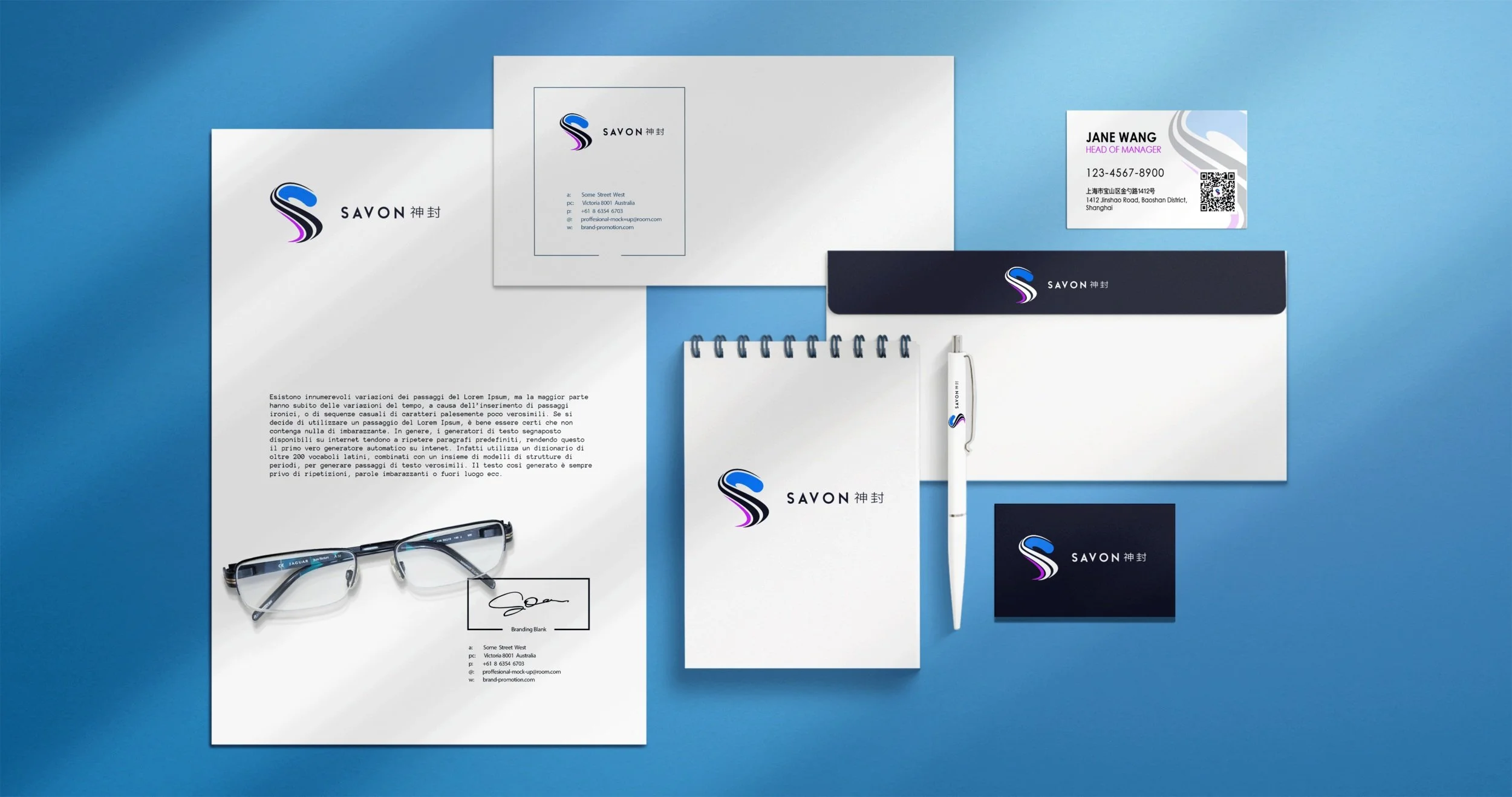
Shanghai Savon Company rebrands logo after 10 years with us giving it a refreshing and modern look as a paint manfucturer.
4. Versatility
Adaptability: The logo should work well in a variety of contexts, ranging from business cards to large-scale billboards. It must maintain its effectiveness whether it is displayed in digital formats or printed materials. Consistency across different applications is also key to establishing a recognizable brand identity. Additionally, the logo should be impactful and effective in both color variations as well as in a classic black and white presentation.
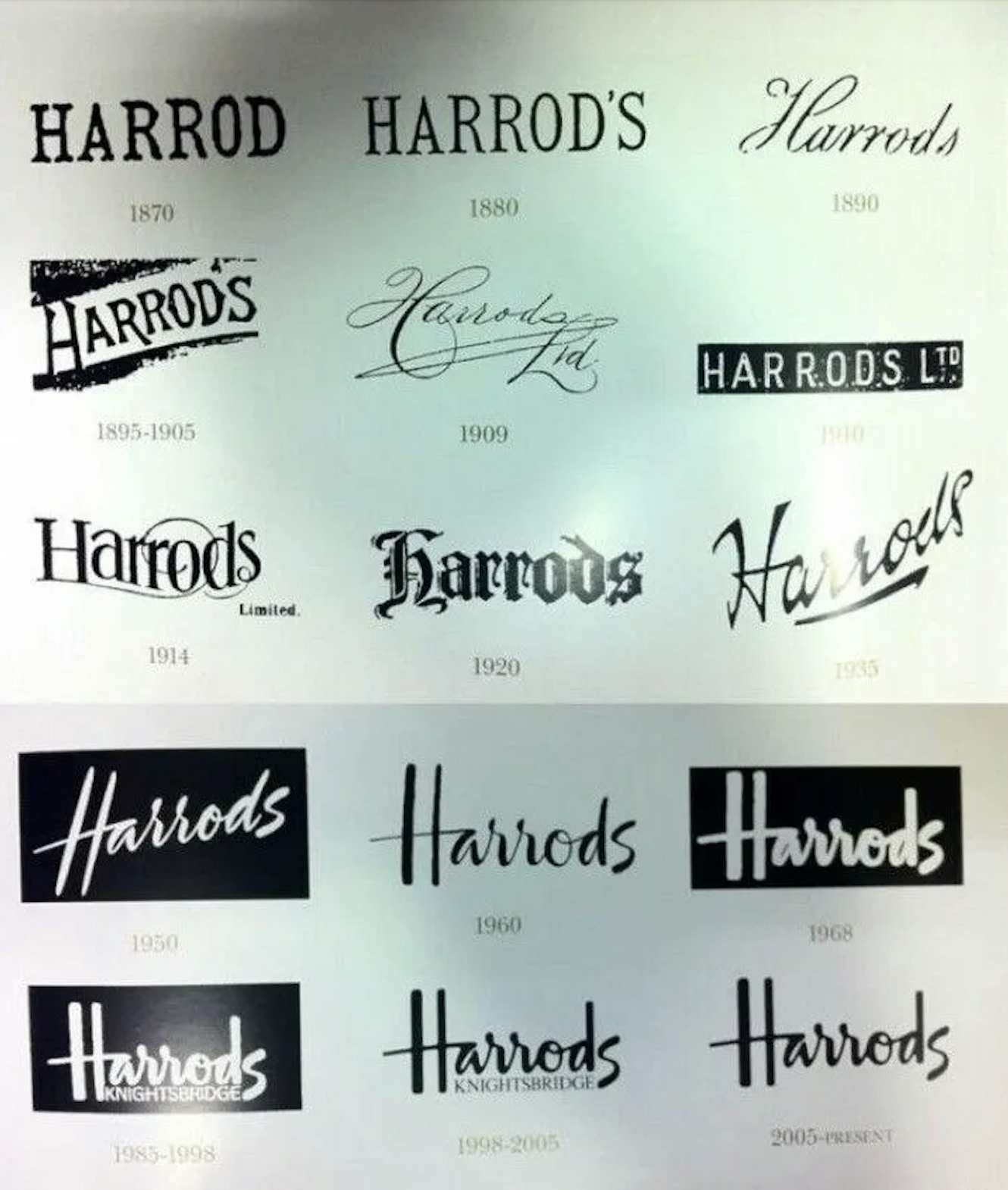
Let’s look at Harrod’s logos from 1870s till the present day.
Harrods logos changes over the years. In reference to: https://fellowstudio.com/brand-identity/blog/harrods-logo-history-origin-meaning/
HARRODS’ LOGO
Harrods’ Typographic logo originated from Charles Henry Harrod's signature, which evolved into its current design.
Harrods has built its brand over nearly 200 years, using strategy and image to establish itself in the luxury market. A dress code and royal endorsements reinforce its high-end luxury appeal. Along with its famous store location, Harrods has become a key British luxury brand, firmly in the minds of its customers over the years.
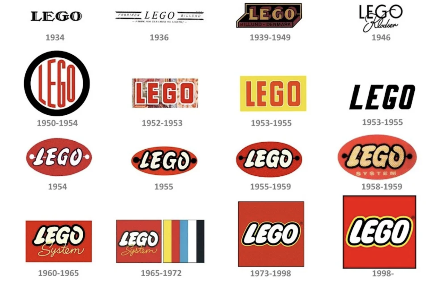
This is the evolution of the Lego Logo. Since 1934, the logo has undergone numerous changes and revisions over the years as they worked diligently to establish their brand identity. After several iterations and thoughtful designs, they finally found success in 1998, which marked a significant milestone in their branding journey.
What is the visual impact of such innovative and creative designs?
Research shows that 50% of people learn better through visuals and that attention spans are getting shorter with only 8.25 minutes. This highlights the importance of visual communication not only in the workplace but also for society. Presenting information visually makes your message more impactful than using text alone. Visual elements are essential in creative work. On platforms like Instagram, Wechat, Weibo, Xiahongshu (Little Redbook), and TikTok, images and videos are much more effective than text content.
Start by focusing on the feelings you want your audience to experience when choosing your brand colors or ad palette. Should they respond with curiosity? Confidence? Use these emotional ad copy examples for inspiration.
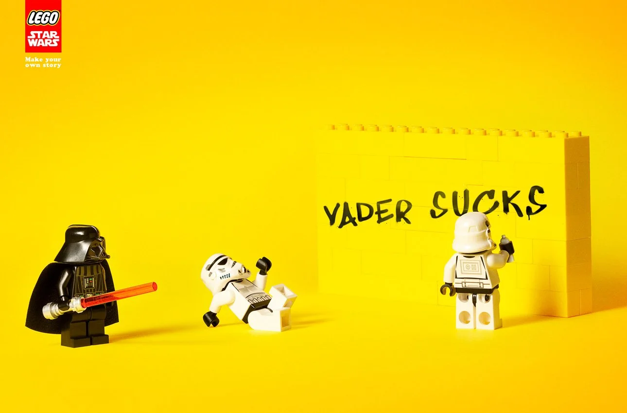
Once you know your goal, choose the right color for your products. Lego’s ads featuring Star Wars use humor to attract buyers, connecting them emotionally to the story and the purchase.
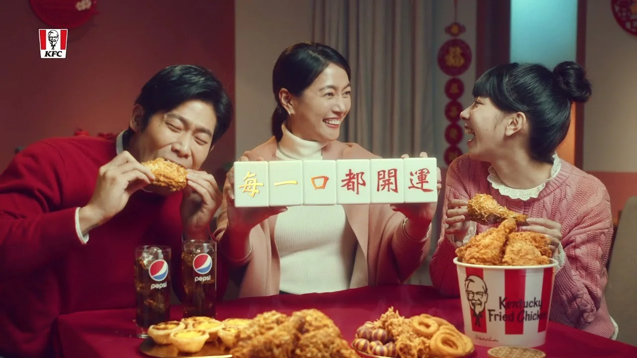
Let’s look at KFC ads in China for Chinese New Year, we embrace cultural and family values, with the sense of community, togetherness to enjoy Finger Lickin good Fried Chicken with friends and family and mahjong with the underlying message of “WINNING BIG IN LIFE.”
In reference to KFC commercial ads: www.youtube.com/watch?v=nNapmtDac-g
McDonald's advertisement contrasts with KFC's advertisement, both highlighting local Chinese pop stars who appeal specifically to younger audiences and millennials. McDonald's focuses on vibrant imagery and catchy jingles, aiming to create a fun and relatable atmosphere. In comparison, KFC emphasizes a sense of community and nostalgia, tapping into the emotional connections young consumers have with their favorite stars. Both strategies reflect a deep understanding of their target markets, making use of popular culture to resonate with a generation that values both entertainment and familiarity in their dining experiences.
Research shows a high increase on viewership and sales after ads. https://pandaily.com/in-china-mcdonalds-and-kfc-are-fighting-for-a-larger-slice-of-the-domestic-pie/
Success ads’ purpose is to attract attention and boosts engagement
Evokes stronger emotions in relation to your brand
Saves time by relaying information efficiently
Solidifies brand identity for a unified message- an experience like no other.
5. Storytelling
Meaningful Design: A logo that tells a story or has a deeper meaning can build a strong emotional bond with the audience and reflect the business vision.
What is your unique business story that sets you apart? What specific qualities or experiences contribute to the distinctiveness of your business compared to others in the industry?
Our First Case Study: Red, from Shark management group from Shenzhen, China.
Her design direction embodies elements that are sexy, mysterious, and undeniably elegant. It aims to create an inviting atmosphere that attracts both local artists and international DJs, fostering a truly unique cultural experience. This is achieved through a blend of captivating music, fine liquor, and an exceptional ambiance that showcases the cool and vibrant essence of Shenzhen, China.
Below are examples of marketing designs using bilingual logos:
Whiskey Testing event with Partners from RJ Clothing, Layers Studio, Hai Seas Distillery, and Tacolicious for being an amazing Venue Sponsor, for communities! ☺️
Designed for Shark Group, featuring AZZURRO’s italian pizzas and dishes in Shenzhen, China.


A remarkable logo seamlessly combines simplicity, relevance, uniqueness, and versatility while effectively representing the brand's identity and core values. By thoughtfully considering these important elements, businesses can create logos that not only capture attention but also leave a lasting and memorable impression on their audience. A well-designed logo serves as an essential asset in building brand recognition and fostering customer loyalty over time.
There is no single correct way to design for different markets; many factors come into play.
Which logos appeal to you? Do you think they improve or decline over time?
References:
https://graphicsprings.com/blog/view/logo-design-quotes/
https://www.thedesigncode.in/the-impact-of-color-psychology-in-interior-design/
